Supervised methods
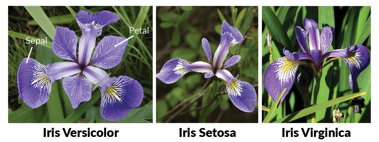
In this practice we are going to use the classic iris data set, trying to classify different varieties of the iris flower according to the length and width of its petals and sepals. We will try to optimize different metrics and see how the different models classify the points and with which we obtain greater precision.
The practice is structured as follows (in which the score for each part is detailed).
- dice loading
- Exploratory data analysis
- k nearest neighbors
- Support vector machines
- decision tree
- Random forest
- Neural networks
Important: Each exercise can take several minutes to execute, so the delivery must be done in notebook and html format, where the code and results can be seen, along with the comments for each exercise.
0. Load from data set
# Importamos librerías
import pandas as pd
import matplotlib as mpl
import matplotlib.pyplot as plt
import seaborn as sns
import numpy as np
import pandas as pd
import colorsys
import graphviz

from pandas.plotting import scatter_matrix
from matplotlib.colors import ListedColormap

from sklearn.ensemble import RandomForestClassifier
from sklearn.preprocessing import StandardScaler
from sklearn import model_selection
from sklearn.metrics import classification_report
from sklearn.metrics import confusion_matrix
from sklearn.metrics import accuracy_score
from sklearn import datasets, neighbors, tree, svm
from sklearn.linear_model import LogisticRegression
from sklearn.tree import DecisionTreeClassifier
from sklearn.neighbors import KNeighborsClassifier
from sklearn.discriminant_analysis import LinearDiscriminantAnalysis
from sklearn.svm import SVC
from sklearn.datasets import load_iris
from sklearn.model_selection import GridSearchCV
from sklearn.neighbors import KNeighborsClassifier
from sklearn.preprocessing import OneHotEncoder
from sklearn import tree
from sklearn.metrics import classification_report, accuracy_score
from sklearn.model_selection import train_test_split
from sklearn.tree import export_graphviz

%matplotlib inline
#Importamos el dataset para iniciar el análisis
#También se podría hacer a partir de la clase datasets
#iris = datasets.load_iris()
iris = pd.read_csv("Iris.csv")
1. Exploratory data analysis
We will explore our data set. To do this, we will carry out the following inspections:
- We will look at the size of the dataset and see if there are null values
- We will calculate the main statistics of the dataset (that is, number of records, mean value, standard deviation and quartiles)
- We will see the distribution of the classes (i.e., if the dataset is balanced)
- We will make some visualizations to get an idea.
We have put in comment form the analyzes that you would have to do
#Visualizamos los primeros 5 datos del dataset
iris = pd.read_csv("Iris.csv")
display(iris.head())
#Eliminamos la primera columna ID
print()
print('------Eliminamos la columna ID-------------')
iris = iris.drop('Id',axis=1)
display(iris.head())
#Forma, tamaño y número de valores del dataset
print()
print('------Información del dataset------')
print(iris.info())
print("El número de líneas es: " + str(iris.shape[0]) + " y el número de columnas: "+ str(iris.shape[1]))

print("No existe ningún null")
display(iris.isnull().sum())

#Resumen estadístico
print()
print('------Descripción del dataset------')
display(iris.describe())

#Grafico Sépalo - Longitud vs Ancho
fig = iris[iris.Species == 'Iris-setosa'].plot(kind='scatter', x='SepalLengthCm', y='SepalWidthCm', color='blue', label='Setosa')
iris[iris.Species == 'Iris-versicolor'].plot(kind='scatter', x='SepalLengthCm', y='SepalWidthCm', color='green', label='Versicolor', ax=fig)
iris[iris.Species == 'Iris-virginica'].plot(kind='scatter', x='SepalLengthCm', y='SepalWidthCm', color='red', label='Virginica', ax=fig)
fig.set_xlabel('Sépalo - Longitud')
fig.set_ylabel('Sépalo - Ancho')
fig.set_title('Sépalo - Longitud vs Ancho')
plt.show()

#Grafico Pétalo - Longitud vs Ancho
fig = iris[iris.Species == 'Iris-setosa'].plot(kind='scatter', x='PetalLengthCm', y='PetalWidthCm', color='blue', label='Setosa')
iris[iris.Species == 'Iris-versicolor'].plot(kind='scatter', x='PetalLengthCm', y='PetalWidthCm', color='green', label='Versicolor', ax=fig)
iris[iris.Species == 'Iris-virginica'].plot(kind='scatter', x='PetalLengthCm', y='PetalWidthCm', color='red', label='Virginica', ax=fig)
fig.set_xlabel('Pétalo - Longitud')
fig.set_ylabel('Pétalo - Ancho')
fig.set_title('Pétalo Longitud vs Ancho')
plt.show()


Univariate analysis is the simplest way to analyze data. It does not deal with causes or relationships (unlike regression) and its main purpose is to describe and find patterns in the data.
To do this we are going to do what is known as Distribution Plots (or histograms). Distribution plots are used to visually evaluate how data points are distributed with respect to their frequency. Typically, data points are grouped into bins and the height of the bars indicates the number of data points (frequency of occurrence).
import warnings
warnings.filterwarnings('ignore')

iris_setosa=iris.loc[iris["Species"]=="Iris-setosa"]
iris_virginica=iris.loc[iris["Species"]=="Iris-virginica"]
iris_versicolor=iris.loc[iris["Species"]=="Iris-versicolor"]


sns.FacetGrid(iris,hue="Species",size=3).map(sns.distplot,"PetalLengthCm").add_legend()
sns.FacetGrid(iris,hue="Species",size=3).map(sns.distplot,"PetalWidthCm").add_legend()
sns.FacetGrid(iris,hue="Species",size=3).map(sns.distplot,"SepalLengthCm").add_legend()
sns.FacetGrid(iris,hue="Species",size=3).map(sns.distplot,"SepalWidthCm").add_legend()
plt.show()


- If we use PetalLengthCm we can separate the iris-setosa species.
- We cannot use SepalLengthCm or SepalWidthCm because everything is mixed and we cannot separate the flowers.
- PetalWidthCm is also not separated correctly.
The only conclusion is that with PetalLengthCm we can separate the iris-setosa species.
A box plot (box plot) is a standardized way of displaying the distribution of data based on a summary of five numbers ("minimum", first quartile (Q1), median, third quartile (Q3), and "maximum"). The box plots They tell us about outliers and what their values are. It can also tell us if the data is symmetrical, clustered, and skewed. To do this we can use the function boxplot of seaborn.

The Violin Plot is a method to visualize the distribution of numerical data of different variables. It is similar to the box plot (box plot) but with a rotated plot on each side that provides more information about the density estimate on the y-axis. The density is reflected and flipped and the resulting shape is filled creating an image that resembles a violin. The advantage of a violin plot is that it can show nuances in the distribution that are not noticeable in a box plot. On the other hand, the boxplot more clearly shows the outliers in the data. Violin plots typically contain more information than box plots although they are less popular.
Now let's plot the violin plots for our iris data set. For this we can use the function violinplot of seaborn . For its interpretation, let us take into account that the rectangle that appears in the violin plot is equivalent to the information given to us by the box plot and that the white circle tells us where the 50th percentile is.
Finally we will carry out a small study using a pair-plot to visualize possible relationships between our variables (pairwise).
In this case we will use the function pairplot from the bookstore seaborn.
import warnings
warnings.filterwarnings('ignore')
sns.boxplot(x="Species",y="PetalLengthCm",data=iris)
plt.show()
sns.boxplot(x="Species",y="PetalWidthCm",data=iris)
plt.show()
sns.boxplot(x="Species",y="SepalLengthCm",data=iris)
plt.show()
sns.boxplot(x="Species",y="SepalWidthCm",data=iris)
plt.show()
display(iris.boxplot())


sns.violinplot(x="Species",y="PetalLengthCm",data=iris)
plt.show()
sns.violinplot(x="Species",y="PetalWidthCm",data=iris)
plt.show()
sns.violinplot(x="Species",y="SepalLengthCm",data=iris)
plt.show()
sns.violinplot(x="Species",y="SepalWidthCm",data=iris)
plt.show()


sns.set_style("whitegrid")
sns.pairplot(iris,hue="Species",size=3);
plt.show()

If we look at the dispersion graphs that relate the characteristics of the sepal field we will see how they are distributed almost uniformly (especially those corresponding to Iris setosa), while those corresponding to versicolor and virginica have somewhat similar qualities so they sometimes overlap.
On the other hand, if we compare the petal, it is a much more uniform distribution compared to the sepal.
If we analyze the violin plot it shows that Iris Virginica has a higher mean value in petal length, petal width and sepal length compared to Versicolor and Setosa. In another sense, Iris Setosa has the highest mean value of sepal width. We can also see a significant difference between the length and width of Setosa's sepal versus the length and width of its petals. That difference is smaller in Versicolor and Virginica. The violin diagram also indicates that the weight of Virginica sepal width and petal width are highly concentrated around the median.
Regarding the box plot, the isolated points that can be seen are the outliers in the data. Since these are very few in number, it would not have any significant impact on our analysis.
Model application
Before applying any model, we have to separate the data between sets of train and test. We will always work on the set of train and we will evaluate the results in the set of test.
It is important to keep in mind that our target variable is categorical. The classifier KNeighborsClassifier does not accept type tags string, so we must transform these labels into numbers (this is what we know as Label encoding).
To do this we will divide the dataset into two arrays: X (characteristics) and Y (labels) and we will apply the following correspondence:
- Iris-setosa corresponds to 0
- Iris-versicolor corresponds to 1
- Iris.virginica corresponds to 2
import pandas as pd
from sklearn.model_selection import train_test_split
from sklearn import preprocessing
label_encoder = preprocessing.LabelEncoder()
iris = pd.read_csv("Iris.csv")
iris = iris.drop('Id',axis=1)
print('----------Aplicación de la correspondecia ----------------------')
print(iris['Species'].unique())
iris['Species']= label_encoder.fit_transform(iris['Species'])
print(iris['Species'].unique())

#X_train, X_test, y_train, y_test = train_test_split(iris[['PetalLengthCm', 'PetalWidthCm','SepalLengthCm','SepalWidthCm']],


print('----------Sepal----------------------')
X_train, X_test, y_train, y_test = train_test_split(iris[['SepalLengthCm', 'SepalWidthCm']],
                                                    iris['Species'],
                                                    test_size=0.2,
                                                    stratify=iris['Species'])
Throughout the exercises we will learn to graphically visualize the decision boundaries that the different models return to us. For this purpose we will use the function defined below (which will help us draw the respective decision boundaries throughout the entire PEC), which follows the following steps:
- Create a meshgrid with the minimum and maximum values of x and y.
- Train the classifier with the values of the meshgrid.
- Makes a reshape of the data to obtain the correct format.
After this process, we can now make the graph of the decision boundaries and add the real points. This way we will see the areas in which the model considers to be of one class and those in which it considers to be of the other. By putting the real points on top we will see if it classifies them correctly.
# Creamos la meshgrid con los valores mínimo y máximo de 'x' i 'y'.
# La variable X es nuestro dataframe con las variables a estudiar (las del pétalo o las del sépalo)
X=iris[['SepalLengthCm', 'SepalWidthCm']].to_numpy()

# Creamos la meshgrid con los valores mínimo y máximo de 'x' i 'y'.

x_min, x_max = X[:, 0].min() - 1, X[:, 0].max() + 1
y_min, y_max = X[:, 1].min() - 1, X[:, 1].max() + 1

# Definimos la función que nos graficará las fronteras de decisión

def plot_decision_boundaries(model, X, y, x_min=x_min,
                             x_max=x_max,
                             y_min=y_min,
                             y_max=y_max,  delta: float = .02) -> None:
    """Plot data points and deicision boundaries learned by the model.

    Arguments:
    ----------
    model: scikit-learn like model

    X: np.array[n_samples, n_features]
        Only first 2 features will be considered because it is a 2d plot.
        Feature 0 in the x axis, and feature 1 in the y axis.

    y: np.array
        Labels for each sample.

    delta: float
        Increment between consecutive points when computing the grid for plotting boundaries.
        Lower value for higher resolution.
    """

    xx, yy = np.meshgrid(np.arange(x_min, x_max, delta),
                         np.arange(y_min, y_max, delta))

    #Predecimos el clasificador con los valores de la meshgrid
    # En este caso model será nuestra variable que contiene el modelo a estudiar, es decir K-nn, SVM,...
    # Por ejemplo para K-nn sería model = KNeighborsClassifier()

    Z = model.predict(np.c_[xx.ravel(), yy.ravel()])

    # Creamos mapas de colores con ListedColormap para ver como separa las clases.
    # En este caso usaremos:
    # Iris-setosa : darkorange
    # Iris-versicolor: c
    # Iris-virginica: darkblue

    cmap_light = ListedColormap(['orange', 'cyan', 'cornflowerblue'])
    cmap_bold = ListedColormap(['darkorange', 'c', 'darkblue'])

    # Ponemos el resultado en una figura de color
    Z = Z.reshape(xx.shape)
    plt.figure()
    plt.pcolormesh(xx, yy, Z, cmap= cmap_light)

    # Dibujamos también los puntos de entrenamiento
    plt.scatter(X[:, 0], X[:, 1], c=y, cmap= cmap_bold)
    plt.xlim(xx.min(), xx.max())
    plt.ylim(yy.min(), yy.max())
    plt.show()


def plot_decision_boundaries_bonus(x, y, labels, model,
                             x_min=x_min,
                             x_max=x_max,
                             y_min=y_min,
                             y_max=y_max,
                             grid_step=0.02):
    xx, yy = np.meshgrid(np.arange(x_min, x_max, grid_step),
                         np.arange(y_min, y_max, grid_step))

    # Predecimos el classifier con los valores de la meshgrid.
    Z = model.predict_proba(np.c_[xx.ravel(), yy.ravel()])[:,1]

    # Hacemos reshape para tener el formato correcto.
    Z = Z.reshape(xx.shape)

    # Seleccionamos una paleta de color.
    arr = plt.cm.coolwarm(np.arange(plt.cm.coolwarm.N))
    arr_hsv = mpl.colors.rgb_to_hsv(arr[:,0:3])
    arr_hsv[:,2] = arr_hsv[:,2] * 1.5
    arr_hsv[:,1] = arr_hsv[:,1] * .5
    arr_hsv = np.clip(arr_hsv, 0, 1)
    arr[:,0:3] = mpl.colors.hsv_to_rgb(arr_hsv)
    my_cmap = ListedColormap(arr)

    # Hacemos el gráfico de las fronteras de decisión.
    fig, ax = plt.subplots(figsize=(7,7))
    plt.pcolormesh(xx, yy, Z, cmap=my_cmap)

    # Añadimos los punts.
    ax.scatter(x, y, c=labels, cmap='coolwarm')
    ax.set_xlim(xx.min(), xx.max())
    ax.set_ylim(yy.min(), yy.max())
    ax.grid(False)
1. k nearest neighbors 
The first algorithm that we will use to classify the points is k-nn. In this exercise we will adjust two hyperparameters to try to obtain greater precision:
- k: the number of neighbors considered to classify a new example. We will try all values between 1 and 10.
- pesos: importance given to each neighbor. In this case we will try two options: uniform weights, where all neighbors are considered equal; and weights according to distance, where the closest neighbors have more weight than the most distant neighbors.
To decide the optimal hyperparameters we will use the technique of grid search, which consists of training a model for each possible combination of hyperparameters and we will evaluate it using cross validation with 4 stratified partitions. Subsequently, we will choose the combination of hyperparameters that has obtained the best results.
To solve the first part you can use the modules GridSearchCV and KNeighborsClassifier of sklearn. For viewing the heatmap you can use the function pivot that the library allows Pandas.
from sklearn.model_selection import GridSearchCV
from sklearn.neighbors import KNeighborsClassifier

clf = KNeighborsClassifier()

param_grid = {"n_neighbors": range(1, 11), "weights": ["uniform", "distance"]}

grid_search = GridSearchCV(clf, param_grid=param_grid, cv=4)

grid_search.fit(X_train, y_train)

means = grid_search.cv_results_["mean_test_score"]
stds = grid_search.cv_results_["std_test_score"]
params = grid_search.cv_results_['params']

for mean, std, pms in zip(means, stds, params):
    print("Precisión media:  {:.2f} +/- {:.2f} con parametros {}".format(mean*100, std*100, pms))
import seaborn as sns

param1 = [x['n_neighbors'] for x in params]
param2 = [x['weights'] for x in params]

precisions = pd.DataFrame(zip(param1, param2, means), columns=['n_neighbors', 'weights', 'means'])
precisions = precisions.pivot('n_neighbors', 'weights', 'means')
sns.heatmap(precisions)

- The best solution has been given with a value k = 9 and the weights calculated with uniform. These results may vary if the training and test set is modified, that is, these results vary by execution of the cell that generates the division.
- The minimum value is 74.17 and the maximum value is 81.67, that is, the difference is 7 percentage points, with standard deviations of the order of 0.5 percentage points we can affirm that there are options that are clearly better than others.
- I have observed that except for k=1 the weights do not matter, for the rest it is significant. At k=1 the new examples are classified with the nearest neighbor class.
- It seems that the precision depends more on k than on the type of weight. Although we observe that the weights with 'uniform' have a lower standard deviation.
clf = KNeighborsClassifier(n_neighbors=9, weights='uniform')
clf.fit(X_train, y_train)
plot_decision_boundaries(X=X_test[['SepalLengthCm', 'SepalWidthCm']].to_numpy(), y=y_test, model=clf)

plot_decision_boundaries_bonus(x=X_test['SepalLengthCm'], y=X_test['SepalWidthCm'], labels=y_test, model=clf)


from sklearn.metrics import confusion_matrix

preds = clf.predict(X_test)

accuracy = np.true_divide(np.sum(preds == y_test), preds.shape[0])*100
cnf_matrix = confusion_matrix(y_test, preds)

print(accuracy)
print(cnf_matrix)
The results have not been very good. The decision border does not seem clear, there are many areas that have not been properly classified.
print('----------Petal----------------------')
print('----------División en entrenamiento y test ----------------------')
X_train, X_test, y_train, y_test = train_test_split(iris[['PetalLengthCm', 'PetalWidthCm']],
                                                    iris['Species'],
                                                    test_size=0.2,
                                                    stratify=iris['Species'])

print('----------Creamos la meshgrid con los valores mínimo y máximo de x y y ----------------------')
X=iris[['PetalLengthCm', 'PetalWidthCm']].to_numpy()
# Creamos la meshgrid con los valores mínimo y máximo de 'x' i 'y'.
x_min, x_max = X[:, 0].min() - 1, X[:, 0].max() + 1
y_min, y_max = X[:, 1].min() - 1, X[:, 1].max() + 1

print('----------Pivoteamos ----------------------')
clf = KNeighborsClassifier()

param_grid = {"n_neighbors": range(1, 11), "weights": ["uniform", "distance"]}

grid_search = GridSearchCV(clf, param_grid=param_grid, cv=4)

grid_search.fit(X_train, y_train)

means = grid_search.cv_results_["mean_test_score"]
stds = grid_search.cv_results_["std_test_score"]
params = grid_search.cv_results_['params']

for mean, std, pms in zip(means, stds, params):
    print("Precisión media: {:.2f} +/- {:.2f} con parametros {}".format(mean*100, std*100, pms))


              param1 = [x['n_neighbors'] for x in params]
              param2 = [x['weights'] for x in params]


              precisions = pd.DataFrame(zip(param1, param2, means), columns=['n_neighbors', 'weights', 'means'])
              precisions = precisions.pivot('n_neighbors', 'weights', 'means')
              sns.heatmap(precisions)

clf = KNeighborsClassifier(n_neighbors=3, weights='uniform')
clf.fit(X_train, y_train)
plot_decision_boundaries(X=X_test[['PetalLengthCm', 'PetalWidthCm']].to_numpy(),x_min=x_min, x_max=x_max ,y_min=y_min, y_max=y_max, y=y_test, model=clf)

plot_decision_boundaries_bonus(x=X_test['PetalLengthCm'], y=X_test['PetalWidthCm'],x_min=x_min, x_max=x_max ,y_min=y_min, y_max=y_max, labels=y_test, model=clf)


preds = clf.predict(X_test)

accuracy = np.true_divide(np.sum(preds == y_test), preds.shape[0])*100
cnf_matrix = confusion_matrix(y_test, preds)

print(accuracy)
print(cnf_matrix)
The resulting decision boundary when we have used the information based on the petals seems more accurate and accurate than the information provided with the sepal. When we have used sépal, "islands" appear and the boundaries between classes are not clear.
The advantages of this algorithm are the following:
Non-parametric. It makes no explicit assumptions about the functional form of the data, avoiding the dangers of the underlying distribution of the data.
Simple algorithm. To explain, understand and interpret.
High precision (relative). It is quite high but not competitive compared to better supervised learning models.
Insensitive to outliers. Accuracy can be affected by noise or irrelevant features.
The disadvantages of this algorithm are:
Instance based. The algorithm does not explicitly learn a model, instead choosing to memorize the training instances which are later used as knowledge for the prediction phase. Concretely, this means that only when a query is made to our database, that is, when we ask it to predict a label given an input, will the algorithm use the training instances to spit out an answer.
Computationally expensive. Because the algorithm stores all the training data.
High memory requirement. Stores all (or almost all) training data.
2.Support Vector Machine 
In this second exercise we will classify the points using the SVM algorithm with different types of kernel. In this case we will use a kernel radial, a kernel linear and a kernel polynomial of degree 3. We will again use a grid search (grid search) for the optimization of hyperparameters.
In this case the hyperparameters to optimize are:
- C: is the regularization, that is, the penalty value of classification errors. We will try the values: 0.01, 0.1, 1, 10, 50, 100 and 200.
- gamma: coefficient that multiplies the distance between two points on the kernel. A roughly, the smaller the gamma, the more influence two nearby points have. We will try the values: 0.001, 0.01, 0.1, 1 and 10.
As in the previous case, to validate the performance of the algorithm we will use cross validation (cross-validation) with 4 stratified partitions. In this case we will only do it for the height-width characteristics of the petal.
Additional material that may help you:
Introduction to Statistical Learning. Gareth James, Daniela Witten, Trevor Hastie and Robert Tibshirani
Support Vector Machines Succinctly. Alexander Kowalczyk
A Practical Guide to Support Vector Classification. Chih-Wei Hsu, Chih-Chung Chang, and Chih-Jen Lin
Tutorial on Support Vector Machines (SVM). Enrique J. Carmona Suárez
A Gentle Introduction to Support Vector Machines in Biomedicine. Alexander Statnikov, Douglas Hardin, Isabelle Guyon, Constantin F. Aliferis
You can use the modules GridSearchCV and svm of sklearn. Analyze what influence the hyperparameters C and gamma once the best hyperparameters have been calculated. For each type of kernel, make predictions for each of them, calculate their confusion matrix and finally draw their decision boundaries.
from sklearn import svm

clf = svm.SVC()

param_grid = {"C": [0.01, 0.1, 1, 10, 50, 100, 200], "gamma": [0.001, 0.01, 0.1, 1, 10]}

grid_search = GridSearchCV(clf, param_grid=param_grid, cv=4)
grid_search.fit(X_train, y_train)

means = grid_search.cv_results_["mean_test_score"]
stds = grid_search.cv_results_["std_test_score"]
params = grid_search.cv_results_['params']

for mean, std, pms in zip(means, stds, params):
    print("Precisión media: {:.2f} +/- {:.2f} con parámetros {}".format(mean*100, std*100, pms))
param1 = [x['C'] for x in params]
param2 = [x['gamma'] for x in params]

precisions = pd.DataFrame(zip(param1, param2, means), columns=['C', 'gamma', 'means'])
precisions = precisions.pivot('C', 'gamma', 'means')
sns.heatmap(precisions)

# Entrenem el classificador amb els paràmetres amb els que hem obtingut major precisió.
clf = svm.SVC(C=100, gamma=0.01, probability=True)
clf.fit(X_train, y_train)

plot_decision_boundaries(X=X_test[['PetalLengthCm', 'PetalWidthCm']].to_numpy(),x_min=x_min, x_max=x_max ,y_min=y_min, y_max=y_max, y=y_test, model=clf)

plot_decision_boundaries_bonus(x=X_test['PetalLengthCm'], y=X_test['PetalWidthCm'],x_min=x_min, x_max=x_max ,y_min=y_min, y_max=y_max, labels=y_test, model=clf)


preds = clf.predict(X_test)

accuracy = np.true_divide(np.sum(preds == y_test), preds.shape[0])*100
cnf_matrix = confusion_matrix(y_test, preds)

print(accuracy)
print(cnf_matrix)
- The parameters that have obtained the best results have been C = 100 and gamma = 0.01 for the executed iteration. Each iteration may vary because the training and test sets are modified.
- We find a maximum difference of 5 percentage points, that is, there is a considerable difference and there are notable variations with the standard deviations. This makes it clear that some combinations are better than others.
- The best solutions are given with gammas between 0.001 and 1. It can be seen that in the best solutions C is quite variable, so we can conclude that the gamma parameter has more weight. It has also been detected that the solution gamma = 10 provides worse results.
The decision boundaries are very fluid and defined. The three well-differentiated classes are observed with only two errors.
3. Decision trees 
In this third exercise we will draw the decision boundaries of the two types of attributes (sepals and petals). We will see what precision we obtain with the decision trees. We will map the tree and analyze it.
To draw the tree we will need to install the library graphviz. To do this from terminal we will write the following command:
sudo apt-get install graphviz
If anyone uses the Conda environment, it can also be installed from this environment.
Decision trees are a method used in different disciplines as a prediction model. These are similar to flowcharts, in which we arrive at points where decisions are made according to a rule.
In the field of machine learning there are different ways to obtain decision trees, the one we will use this time is known as CART: Classification And Regression Trees. This is a supervised learning technique. We have a target variable (dependent) and our goal is to obtain a function that allows us to predict, from predictor variables (independent), the value of the target variable for unknown cases.
As the name indicates, CART is a technique with which classification and regression trees can be obtained. We use classification when our target variable is discrete, while we use regression when it is continuous. We will have a discrete variable, so we will do classification.
In general, what this algorithm does is find the independent variable that best separates our data into groups, which correspond to the categories of the target variable. This best separation is expressed with a rule. Each rule corresponds to a node.
To do this, we must make sure that we have the library installed in our environment. graphviz.
from sklearn.tree import DecisionTreeClassifier

clf = DecisionTreeClassifier()

param_grid = {"max_depth": range(4, 10), "min_samples_split": [2, 10, 20, 50, 100]}

grid_search = GridSearchCV(clf, param_grid=param_grid, cv=4)
grid_search.fit(X_train, y_train)

means = grid_search.cv_results_["mean_test_score"]
stds = grid_search.cv_results_["std_test_score"]
params = grid_search.cv_results_['params']

for mean, std, pms in zip(means, stds, params):
    print("Precisión media  {:.2f} +/- {:.2f} con parametros {}".format(mean*100, std*100, pms))
clf = DecisionTreeClassifier(max_depth = 4, min_samples_split = 10)
clf.fit(X_train, y_train)

from sklearn.tree import export_graphviz
from pydotplus import graph_from_dot_data

dot_data = export_graphviz(clf)
from IPython.display import Image as PImage

graph = graph_from_dot_data(dot_data)
graph.write_png('tree.png')
PImage("tree.png")

The tree interpretation of this decision tree would be: if the petal width is less than 0.8 centimeters, then the iris flower belongs to the iris-setosa variety. If, on the other hand, the length of the petal is greater than 0.8 centimeters and greater than 1.75 it belongs to Iris.virginica. If it is greater than 0.8 centimeters and less than 1.75, we will look at the length of the petal. If the length is greater than 5.45, it is directly Iris.virginica. If the length is less than 5.45 cm and the width is less than 1.65 then it is Iris-versicolor and if it is greater than 1.65 cm Iris.virginica
- Gini index: It is used for attributes with continuous values (price of a house). This cost function measures the “degree of impurity” of the nodes, that is, how disordered or mixed the nodes are once divided. Gini is a measure of impurity. When Gini is 0, it means that that node is totally pure, that is, this should be our goal.
Among other data mining methods, decision trees have several advantages:
- Easy to understand and interpret. People are able to understand decision tree models after a brief explanation.
- Requires little data preparation. Other techniques often require data normalization, dummy variables need to be created and blank values need to be removed.
- Able to handle both numerical and categorized data. Other techniques are generally specialized in analyzing data sets that have only one type of variable. (For example, ratio rules can only be used with nominal variables, while neural networks can be used only with numerical variables.)
- Use a white box model. If a given situation is observable in a model then the condition is easily explained by Boolean logic. (An example of a black box model is an artificial neural network since the explanation of the results is difficult to understand.)
- It is possible to validate a model using statistical tests. This makes it possible to take into account the reliability of the model.
- Robust. It performs well even if its assumptions are violated by the true model from which the data was generated.
- Works well with large data sets. Large amounts of data can be analyzed using standard computing resources in a reasonable time frame.
Disadvantages
- Overfitting
- Loss of information when categorizing continuous variables
- Instability: A small change in data can greatly modify the structure of the tree. Therefore the interpretation is not as direct as it seems.
preds = clf.predict(X_test)

accuracy = np.true_divide(np.sum(preds == y_test), preds.shape[0])*100
cnf_matrix = confusion_matrix(y_test, preds)

print(accuracy)
print(cnf_matrix)
plot_decision_boundaries(X=X_test[['PetalLengthCm', 'PetalWidthCm']].to_numpy(),x_min=x_min, x_max=x_max ,y_min=y_min, y_max=y_max, y=y_test, model=clf)

plot_decision_boundaries_bonus(x=X_test['PetalLengthCm'], y=X_test['PetalWidthCm'],x_min=x_min, x_max=x_max ,y_min=y_min, y_max=y_max, labels=y_test, model=clf)


Decision boundaries are fluid and defined. The three well-differentiated classes are observed with only two errors.
4.Random forest 
In this fourth section we will classify the points using a Random forest. We will use, as in the previous cases, a grid search (grid search) stop adjusting the hyperparameters.
In this case, the hyperparameters that we must adjust are:
- max_depth: The maximum depth of the tree. We will explore values between 6 and 12.
- n_estimators: name of trees. We will explore the values: 10, 50, 100 and 200.
As in the previous case, we will use cross validation (cross-validation) with 4 stratified partitions to validate the performance of the algorithm with each combination of hyperparameters.
You can use the modules GridSearchCV and RandomForestClassifier of sklearn.
from sklearn.ensemble import RandomForestClassifier

clf = RandomForestClassifier()

param_grid = {"max_depth": range(6, 13), "n_estimators": [10, 50, 100, 200]}

grid_search = GridSearchCV(clf, param_grid=param_grid, cv=4)
grid_search.fit(X_train, y_train)

means = grid_search.cv_results_["mean_test_score"]
stds = grid_search.cv_results_["std_test_score"]
params = grid_search.cv_results_['params']

for mean, std, pms in zip(means, stds, params):
    print("Precisión Media  {:.2f} +/- {:.2f} con parametros {}".format(mean*100, std*100, pms))

              param1 = [x['max_depth'] for x in params]
              param2 = [x['n_estimators'] for x in params]

              precisions = pd.DataFrame(zip(param1, param2, means), columns=['max_depth', 'n_estimators', 'means'])
              precisions = precisions.pivot('max_depth', 'n_estimators', 'means')
              sns.heatmap(precisions)

- We have obtained the best result with max_depth = 12 and n_estimators = 10 (it may vary depending on the distribution of the training and test set)
- The differences are almost 2 percentage points at most, that is, it is quite small.
- I have not observed in this iteration any relationship that makes me see a greater influence. I expected that the larger the n_estimators, the greater the precision, but this has not been the case.
In the previous practice we were studying the influence of some of the parameters of the Random forest, among them the parameter max_depth and how too large a tree depth could cause what we know as overtraining (overfitting).
In this section we are going to use the interactive capabilities that the library offers us. plotly to view effects of overfitting and how the decision boundary changes because of it. To do this, we will create graphs of two Random Forest classifiers, the first with a reasonable tree depth (max_depth=4) and the second presenting a clear overfitting (e.g. max_depth=300).
Invoke the code Plotly It is very similar to that of Matplotlib to generate the decision boundary. We will need a mesh Numpy to form the basis of our surface graphs, as well as the method predict of the learning model to populate our frontier with data.
Remember that you will have to install the release Plotly. This can be done by:
pip install plotly
Note: You don't need to do it for all four characteristics (height-width of the petal and height-width of the sepal), doing it for two would be enough.
clf = RandomForestClassifier(n_estimators = 10, max_depth = 4)
clf.fit(X_train, y_train)

plot_decision_boundaries(X=X_test[['PetalLengthCm', 'PetalWidthCm']].to_numpy(),x_min=x_min, x_max=x_max ,y_min=y_min, y_max=y_max, y=y_test, model=clf)


clf = RandomForestClassifier(n_estimators = 10, max_depth = 300)
clf.fit(X_train, y_train)

plot_decision_boundaries(X=X_test[['PetalLengthCm', 'PetalWidthCm']].to_numpy(),x_min=x_min, x_max=x_max ,y_min=y_min, y_max=y_max, y=y_test, model=clf)


Advantages of Random Forest
- There are very few assumptions and therefore data preparation is minimal.
- It can handle up to thousands of input variables and identify the most significant ones. Dimensionality reduction method.
- One of the outputs of the model is the importance of variables.
- Incorporates effective methods to estimate missing values.
- It is possible to use it as an unsupervised method (clustering) and outlier detection.
Disadvantages of Random Forest
- Loss of interpretation
- Good for classification, not so much for regression. The predictions are not continuous in nature.
- In regression, you cannot predict beyond the range of values of the training set.
- Little control over what the model does (black box model for statistical modelers)
5. Neural networks 
In this last part of the PEC we are going to use the library Keras. To do this we will compare the networks with the regular dense layer (regular Dense Layer) with a different number of nodes, using as activation function softmax and as an optimizer Adam.
To do this we will have to make sure we have the libraries Tensorflow and Keras installed.
To do this from terminal we will write the following command:
pip install tensorflow
pip install keras
If anyone uses the Conda environment, it can also be installed from this environment.
On the other hand, this is the most complicated section of the entire practice and the one with which you are least familiar. For this reason, throughout the section we will give you a series of links to concepts and examples that will help you better understand what we are doing. It is highly recommended Carefully read the links (marked in blue) and references indicated and understand the theoretical explanations and code examples provided.
# Importamos la librerías necesarias
import numpy as np
import pandas as pd
import matplotlib.pyplot as plt
import tensorflow as tf

from sklearn.datasets import load_iris
from sklearn.model_selection import train_test_split
from sklearn.preprocessing import OneHotEncoder, StandardScaler


from tensorflow.python.keras.models import Sequential
from tensorflow.python.keras.layers import Dense
from tensorflow.python.keras.callbacks import TensorBoard
from tensorflow.python.keras.wrappers.scikit_learn import KerasClassifier

from sklearn.metrics import roc_curve, auc
from sklearn.model_selection import cross_val_score

# Para ignorar Warnings futuros
import warnings
warnings.simplefilter(action='ignore', category=FutureWarning)

plt.style.use('ggplot')
%matplotlib inline
To prepare the data, we will simply use the OneHotEncoder to encode the entire features in a One-hot vector and we will use a StandardScaler to remove the mean and scale the features to unit variance. Finally, we will use train_test_split to compare our results later.
iris = load_iris()
X = iris['data'][:,[2,3]]
y = iris['target']
names = iris['target_names']
feature_names = iris['feature_names']

# One hot encoding
enc = OneHotEncoder()
Y = enc.fit_transform(y[:, np.newaxis]).toarray()

# Scale data to have mean 0 and variance 1
# which is importance for convergence of the neural network
scaler = StandardScaler()
X_scaled = scaler.fit_transform(X)

# Split the data set into training and testing
X_train, X_test, Y_train, Y_test = train_test_split(
    X_scaled, Y, test_size=0.3, random_state=2)

n_features = X.shape[1]
n_classes = Y.shape[1]
We configure our neural network models
To do this, we define a function that will be responsible for creating our models (in this specific case we are going to create three models that we will call Model1, Model2 and Model3). We will use as activation function the ReLu function and how loss function the categorical_crossentropy function
For more depth on the study of the activation functions:
- https://scikit-learn.org/stable/modules/generated/sklearn.preprocessing.StandardScaler.html
- https://towardsdatascience.com/activation-functions-neural-networks-1cbd9f8d91d6
- https://medium.com/the-theory-of-everything/understanding-activation-functions-in-neural-networks-9491262884e0
For greater depth in the study of the loss functions:
def create_custom_model(input_dim, output_dim, nodes, n=1, name='model'):
    def create_model():

        # Creamos el modelo
        model = Sequential(name=name)
        for i in range(n):
            model.add(Dense(nodes, input_dim=input_dim, activation='relu'))
        model.add(Dense(output_dim, activation='softmax'))

        # Compilamos el modelo
        model.compile(loss='categorical_crossentropy',
                      optimizer='adam',
                      metrics=['accuracy'])
        return model
    return create_model

models = [create_custom_model(n_features, n_classes, 8, i, 'model_{}'.format(i))
          for i in range(1, 4)]

for create_model in models:
    create_model().summary()
from keras.callbacks import TensorBoard

history_dict = {}

# TensorBoard Callback
cb = TensorBoard()

for create_model in models:
    model = create_model()
    print('Model name:', model.name)
    history_callback = model.fit(X_train, Y_train,
                                 batch_size=5,
                                 epochs=50,
                                 verbose=0,
                                 validation_data=(X_test, Y_test),
                                 callbacks=[cb])
    score = model.evaluate(X_test, Y_test, verbose=0)
    print('Test loss:', score[0])
    print('Test accuracy:', score[1])

    history_dict[model.name] = [history_callback, model]
Viewing results
fig, (ax1, ax2) = plt.subplots(2, figsize=(8, 6))

for model_name in history_dict:
    val_acc = history_dict[model_name][0].history['val_accuracy']
    val_loss = history_dict[model_name][0].history['val_loss']
    ax1.plot(val_acc, label=model_name)
    ax2.plot(val_loss, label=model_name)

ax1.set_ylabel('validation accuracy')
ax2.set_ylabel('validation loss')
ax2.set_xlabel('epochs')
ax1.legend()
ax2.legend()
plt.show()


from sklearn.metrics import roc_curve, auc

plt.figure(figsize=(10, 10))
plt.plot([0, 1], [0, 1], 'k--')

for model_name in history_dict:
    model = history_dict[model_name][1]

    Y_pred = model.predict(X_test)
    fpr, tpr, threshold = roc_curve(Y_test.ravel(), Y_pred.ravel())

    plt.plot(fpr, tpr, label='{}, AUC = {:.3f}'.format(model_name, auc(fpr, tpr)))
plt.xlabel('False positive rate')
plt.ylabel('True positive rate')
plt.title('ROC curve')
plt.legend();


from keras.wrappers.scikit_learn import KerasClassifier
from sklearn.model_selection import cross_val_score

create_model = create_custom_model(n_features, n_classes, 8, 3)

estimator = KerasClassifier(build_fn=create_model, epochs=50, batch_size=5, verbose=0)
scores = cross_val_score(estimator, X_scaled, Y, cv=10)
print("Accuracy : {:0.2f} (+/- {:0.2f})".format(scores.mean(), scores.std()))


Knowing that the ROC graph compares the false positive rate with the true positive rate, I have decided to use this value to see which model has obtained better results. The results obtained have been very good, in all models we have obtained values close to 1. I think that model 3 is the best of all.
Furthermore, we calculate for each model the Area Under the Curve (AUC), where auc = 1 is a perfect classification and auc = 0.5 is a random guess and, in this case, we obtain results very close to 1.
model.fit(X_train, Y_train,batch_size=5,
                                 epochs=50,
                                 verbose=0,
                                 validation_data=(X_test, Y_test),
                                 callbacks=[cb])

plot_decision_boundaries_bonus(X_test[:,[0]],X_test[:,[1]], Y_test, model)
